Why Rush Went ‘Minimal’ for Cover of Final LP, ‘Clockwork Angels’
Art director Hugh Syme considers Rush's 2012 LP, Clockwork Angels, the band's "opus," particularly for Neil Peart. And given the lengthier undertaking behind their final record, he earned a clear "window" into the drummer and lyricist's "working process and expectations."
"There was a lot of good fortune in our timing on that," he tells UCR. "They were having a good time [on the 2010-11 Time Machine tour], which was rare because Neil didn't normally like to tour. ... They decided to do a European leg, I believe. They were going to leak two songs ['Caravan' and 'BU2B'] from the forthcoming album [as] sort of a 'work-in-progress' — something they'd never done before. And the reason was that they didn't have the album anywhere near ready. They had those two songs in the can and played them live."
Previewing the project made sense commercially, generating fan hype for what became their first album since 2007's Snakes & Arrows. The slower pace allowed Peart to spend more time refining his lyrics, which later spawned an entire sci-fi novel co-written with Kevin J. Anderson.
Syme also benefitted from that timeline, with more flexibility to brainstorm visual concepts — first with the "Caravan" and "BU2B" single covers, later for the full LP. "I was able to spend the better part of 18 to 20 months preparing the artwork for what was promising to be … an epic undertaking," he says.
"I knew from talking to Neil how important this one was to him because it was a book in development," he continues. "The story kept growing and growing! It was one of the first full epic albums they'd done since 2112 [in 1976]. And I could just hear in his tone how much he was invested in this." And Peart, as became more frequent on Rush's later albums, had a clear vision of what the cover might look like.
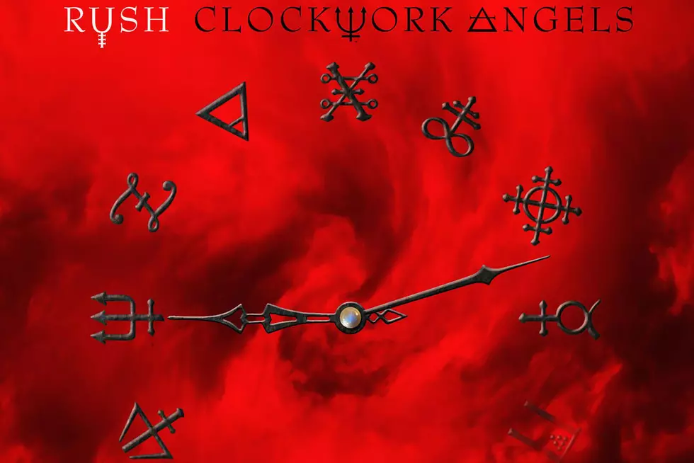
"He liked the idea of just the clock and those alchemic symbols," Syme says, describing the final product. "I said, 'They'll have a nice home in the package somewhere.' It was one of those [moments of], 'No, I want that on the cover.' I remember feeling a little compromised by that summary request. But it did work really well. It ended up being a clean, iconic, minimal cover."
That image, like the simple graphic on 1987's Hold Your Fire, is just a teaser for the more robust designs inside. "I think it coexisted nicely against what would eventually be revealed in my illustrations for the inner package," he notes. "The rationale I had adhered to on Hold Your Fire found its place in Rush history once again." Syme admits that, had he been "left to his own devices to do cover for such an epic saga," he probably would have created something slightly more "picturesque" and "environmental."
But he's realized over time that the drummer's instincts were correct, as usual.
"The client," he says, "was right."
Rush Albums Ranked

More From 99.1 The Whale
![The Absolute Worst Uniforms in NFL History [GALLERY]](http://townsquare.media/site/501/files/2020/04/GettyImages-613633666.jpg?w=980&q=75)