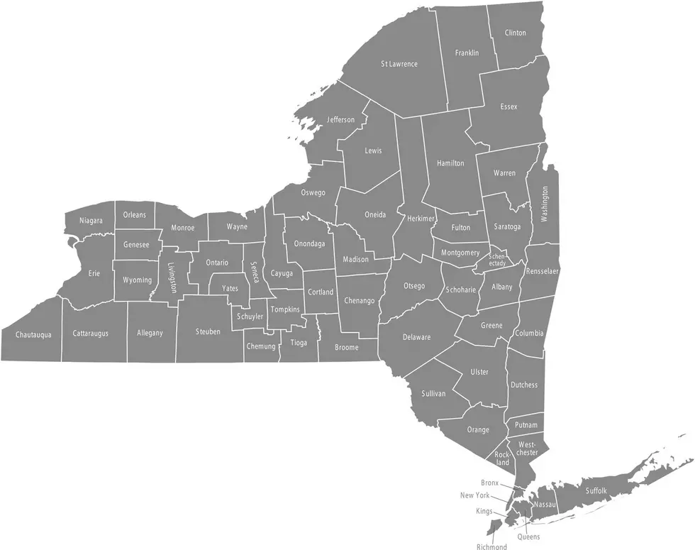
![The COVID-19 Risk Level Of Attending An Event In Every County [MAP]](http://townsquare.media/site/497/files/2020/07/COVID-Map.jpg?w=980&q=75)
The COVID-19 Risk Level Of Attending An Event In Every County [MAP]
Okay, I will admit it. I have an obsession with maps. Back in the day when paper maps were all we had, I would have one of the United States pinned up on my wall along side a map of the world.
Maybe it was because I had a curiosity of what places in the world looked like other than the country home I grew up in. Whenever we traveled (which was rare) across the border of New York State into Pennsylvania, I thought I had landed in a different world. Yea, it's only a state border, but it was a big deal.
As an adult, when I planned a vacation, I would get one of those travel agency trip maps to guide me to my destination. It was so cool. And then came the GPS. Look out, I am in heaven.
And finally, Google Maps came on the scene along with street view. I never thought in my lifetime, I'd get to see the world from the computer in my home, almost as if I was there. Every so often, when I'm bored (mostly in the winter) I will open up Google Maps and click on any one location in the world, and use street view to see what that area looks like.
Speaking of maps, I just found one from Georgia Tech that is a Covid-19 Event Risk Assessment Planning Tool. This map shows what the level of risk would be if you attend an event in every county in the United States.
You simply zoom in to find the county, choose the number of people attending the event and then hover your mouse over the county for the current risk level. The percentage level is an estimate showing a chance that at the least one person at the event could be Covid-19 positive.
What a difference there is between northeastern part of the country versus the south. The site also has several other features you can look at as well. Check out the Georgia Tech Risk Assessment Planning Tool here.
via Georgia Tech

KEEP READING: See notable new words that were coined the year you were born
More From 99.1 The Whale