Seattle Kraken Becomes the NHL’s 32nd Franchise
Let's get "Kraken"!
There's a lot going on here, so let's break it down:
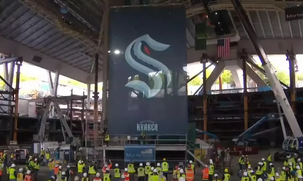
The logo is in the shape of an "S", which according to the team is a nod to the Seattle Metropolitans, the first American team to win the Stanley Cup.
The dark line running through the "S" is a tentacle. Even better is the public relations speak from the team in the logo breakdown above: "How many are there? How deep do they go? The real peril lies in what you don't see." Apparently a 14 year-old obsessed with My Chemical Romance wrote that, or something.
The red eye is pretty self-explanatory, it the eye of the Kraken, a mythological Scandinavian sea beast. Let's go back to the P.R. speak. The explanation graphic says, and I kid you not:
"If you've seen it, it's already too late. The eye of the Kraken has been affixed on its prey for some time. Its strike will be swift and devastating. Its opposition will be overwhelmed and unwary. It will all be over soon."
Geez... calm down.
Alongside the logo is a secondary, anchor logo that also incorporates the outline of the Space Needle in Seattle.
As far as the uniforms go, they're so incredibly clean. It's simple without being boring and interesting without being gaudy. The colors are fantastic and the font is lovely.
No just be prepared to hear the "Release the Kraken" clip from 2010's Clash of the Titans at least three trillion times.
More From 99.1 The Whale


